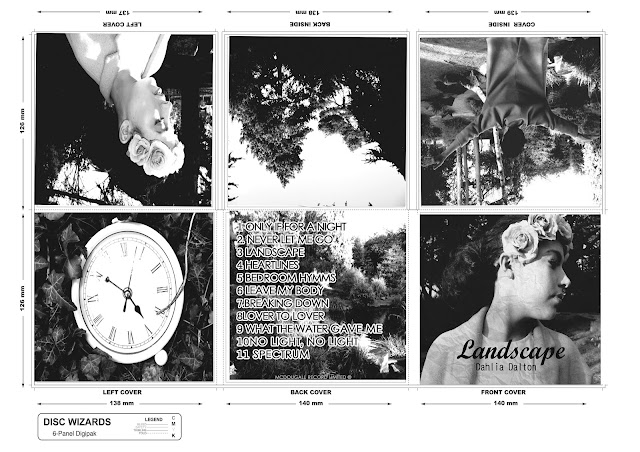
This was a quick draft of my digi-pak that I created.
STEP 1
Firstly, I opened my choosen image for my album cover into Photoshop using File and then Open. Then, duplicated the layer by going to Layer - New then Layer via Copy.
Then to change the image to black and white I went to Image - Desaturate which basically removes all colour from the image. After this, I again made another layer by the same commands.
Changing the image so it's inverted meaning the light parts of the image turn black and vice versa I basically went to Image - Adjustments - Invert. Also, changing the blend layer to Colour Dodge making the image completely blank.
Here, to get the sketch effect I chose Filter- Other - Minimum and left the Radius and Pixel at 1. Then Merge visable to merge the two layers together.
To finally add colour to the image I basically duplicated the original background and also changing the Blend Layer to Colour with a 65% Opacity adding a hint of colour to the image.
After adding the text and filling in the background I decided I was get going to make another draft and alter a few changes. For example, I want to make the background a lighter ivory colour to blend into the image as it's too yellowy. I also wanted to change the text with the pink outline around it, I want to make it stuttle and make the pink the same as the floral headband.
Heres my 3rd and final draft of my CD Album Cover that will be the central part of my digi-pak.
For the text on my album cover I basically used a website called dafont.com which is a website containing lots of different fonts which you can either download or type in the word you can to sample it and what I did, was save it as an image and put it on my product. I decided to use a different website as I found the fonts that already came on the Photoshop software very limiting and didn't have the types of handwritten fonts I was looking for.


No comments:
Post a Comment